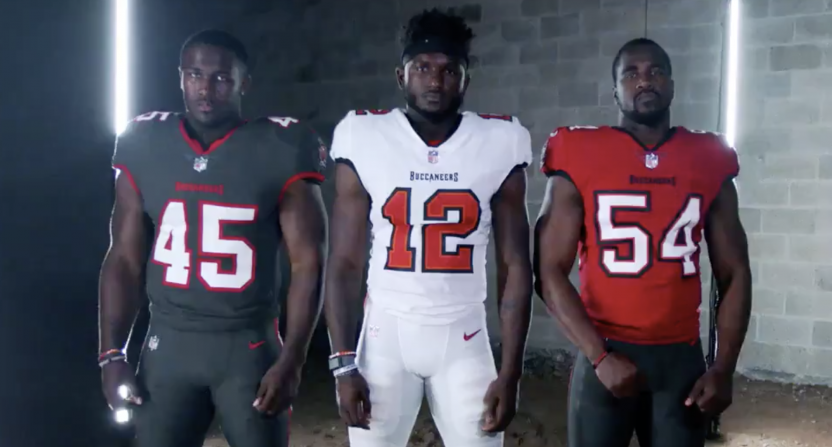
The Colts has dropped their new uniforms.
I dig the old school number font that the Colts used in the 1950s and 1960s, reminiscing the early years when they played in Baltimore. I also liked the newly updated wordmark, removing the old tall, plump logo that they used for years.
What I don't is the secondary logo. Sure it pays respect for the years of having the team in the state of Indiana in the center of the horshoe-styled "C," but the graphic looked kinda lazy. It's a miss for me.
Overall, the classic number font and the new wordmark were winners to me, without making any drastic changes to their uniforms and paying homage to their past by bringing back to the "Bucking Horse" historic logo.


