Reminds me of @DeathLock and his character.A lot like Finn Bálor, I know. I'm unoriginal... lol
That's why I'm thinking of other gimmicks that he could fill. You have any suggestions, let me know bud
.4:
OOC The Out of Character Thread
- Thread starter Nostradamus
- Start date
-
Welcome to "The New" Wrestling Smarks Forum!
I see that you are not currently registered on our forum. It only takes a second, and you can even login with your Facebook! If you would like to register now, pease click here: Register
Once registered please introduce yourself in our introduction thread which can be found here: Introduction Board
You are using an out of date browser. It may not display this or other websites correctly.
You should upgrade or use an alternative browser.
You should upgrade or use an alternative browser.
- Status
- Not open for further replies.
More options
Who Replied?- Joined
- Jan 23, 2017
- Messages
- 824
- Reaction score
- 959
- Points
- 93
- Age
- 27
- Favorite Wrestler
-

- Favorite Wrestler
-

Yeah...I thought he looked....A LOT like Finn Balor when I saw the image...No, like all he needs is the leather jacket and pastier skin and he is Finn Balor.
Honestly...you should try to change more to make him your own. Just changing a few words doesn't make him your own, it isn't anything unique. There is nothing wrong with taking inspiration, but there is a line where it goes from taking "inspiration" and then copying and with the similar attire and appearance, I think that is being on the lines of copying. Quite literally almost the same attire, face painted alter-ego with a name relating to the supernatural, beard, short hair. I'm not trying to be harsh, but I think you need to make a fair bit of changes to make him your own.
Edit: And I get it, these days almost nothing is original and it isn't easy making a good character, but still...just a bit too much like Finn Balor...
Yeah, I'll think of something else for an attire & gimmick (At least I got the curly mustache and matching goatee going on) Thanks for your honesty bud!
- Joined
- Apr 16, 2016
- Messages
- 45,687
- Reaction score
- 21,149
- Points
- 128
- Location
- New Brunswick, Canada
- Favorite Wrestler
-

- Favorite Wrestler
-

- Favorite Wrestler
-

- Favorite Wrestler
-

- Favorite Wrestler
-

- Favorite Wrestler
-

- Favorite Sports Team
-

- Favorite Sports Team
-

- Favorite Sports Team
-

- Favorite Sports Team
-

Yeah, I'll think of something else for an attire & gimmick (At least I got the curly mustache and matching goatee going on) Thanks for your honesty bud!
I say keep the face if ya want...the Moustache is very fancy.
But change the attire up more and think of a new gimmick.
I miss himReminds me of @DeathLock and his character.
- Joined
- Jan 23, 2017
- Messages
- 824
- Reaction score
- 959
- Points
- 93
- Age
- 27
- Favorite Wrestler
-

- Favorite Wrestler
-

UPDATE ON MY CAW:
I Introduce to you the "Modern Day Gentleman" William McCoy!
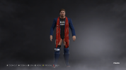
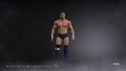
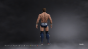
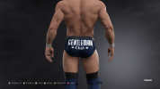
I believe that it is quite an improvement from my last design, plus he has a gimmick now that is sorta kinda unique. So there's that. What do you guys think?
@Beavs
I Introduce to you the "Modern Day Gentleman" William McCoy!


I believe that it is quite an improvement from my last design, plus he has a gimmick now that is sorta kinda unique. So there's that. What do you guys think?
@Beavs
... @DeathLock75 Hybrid says he misses you.I miss him
I'm bored so why not randomly give you pointers on the thing I know nothing about?UPDATE ON MY CAW:
I Introduce to you the "Modern Day Gentleman" William McCoy!
View attachment 2820 View attachment 2821 View attachment 2822 View attachment 2823
I believe that it is quite an improvement from my last design, plus he has a gimmick now that is sorta kinda unique. So there's that. What do you guys think?
@Beavs
-Scarf looks nice but the design on it looks like someone drew on it. Like I can literally see a stick figure there lol. Maybe have it as stripes of red and darker…red or something? Just a suggestion
-I love the belt that you put there, that really works with it.
-Logos basic, like it but I would have the gentleman text maybe be the same font as club just as a personal preference, you don’t have to change that. I don’t mind
-I was about to say something about the shoes being red but then I realised the scarf and now I like it.
-Is it possible to have it the logo on both on the knee pads? It’s fine if you have a finisher like GTS or Nakamura knee or something like that where he hit someone with your knee. But if that’s not the case then it looks like weird to me.
-Facial hair on point.
Overall 76/100 moustaches
- Joined
- Jan 23, 2017
- Messages
- 824
- Reaction score
- 959
- Points
- 93
- Age
- 27
- Favorite Wrestler
-

- Favorite Wrestler
-

... @DeathLock75 Hybrid says he misses you.
I'm bored so why not randomly give you pointers on the thing I know nothing about?Like literally look at this monstrosity.
Anyways...Pointers.
-Scarf looks nice but the design on it looks like someone drew on it. Like I can literally see a stick figure there lol. Maybe have it as stripes of red and darker…red or something? Just a suggestion
-I love the belt that you put there, that really works with it.
-Logos basic, like it but I would have the gentleman text maybe be the same font as club just as a personal preference, you don’t have to change that. I don’t mind
-I was about to say something about the shoes being red but then I realised the scarf and now I like it.
-Is it possible to have it the logo on both on the knee pads? It’s fine if you have a finisher like GTS or Nakamura knee or something like that where he hit someone with your knee. But if that’s not the case then it looks like weird to me.
-Facial hair on point.
Overall 76/100 moustaches
I'll take a 76% pass rate lol C's get decent CAWS
- Joined
- Apr 16, 2016
- Messages
- 45,687
- Reaction score
- 21,149
- Points
- 128
- Location
- New Brunswick, Canada
- Favorite Wrestler
-

- Favorite Wrestler
-

- Favorite Wrestler
-

- Favorite Wrestler
-

- Favorite Wrestler
-

- Favorite Wrestler
-

- Favorite Sports Team
-

- Favorite Sports Team
-

- Favorite Sports Team
-

- Favorite Sports Team
-

UPDATE ON MY CAW:
I Introduce to you the "Modern Day Gentleman" William McCoy!
View attachment 2820 View attachment 2821 View attachment 2822 View attachment 2823
I believe that it is quite an improvement from my last design, plus he has a gimmick now that is sorta kinda unique. So there's that. What do you guys think?
@Beavs
Pretty freaking sweet...
- Joined
- Apr 13, 2016
- Messages
- 1,113
- Reaction score
- 480
- Points
- 83
- Age
- 28
- Favorite Wrestler
-

- Favorite Wrestler
-

- Favorite Wrestler
-

- Favorite Wrestler
-

- Favorite Sports Team
-

- Favorite Sports Team
-

boooooI remember now why this place is dead.
- Joined
- Apr 14, 2016
- Messages
- 938
- Reaction score
- 670
- Points
- 0
- Age
- 31
Fifty thousand people used to live here... Now it's a ghost town.Why you say that?
- Joined
- Jan 23, 2017
- Messages
- 824
- Reaction score
- 959
- Points
- 93
- Age
- 27
- Favorite Wrestler
-

- Favorite Wrestler
-

Back in 2k14 the Xbox league (when I was here last) was always busy. Now its slowly becoming a place of silence.
We're like the Ratway in Skyrim...
We're like the Ratway in Skyrim...
I think it has to do with the Xbox install base for WWE games and a lack of recruitment.Back in 2k14 the Xbox league (when I was here last) was always busy. Now its slowly becoming a place of silence.
We're like the Ratway in Skyrim...
- Status
- Not open for further replies.


