Kanye West

  • Welcome to "The New" Wrestling Smarks Forum!

    I see that you are not currently registered on our forum. It only takes a second, and you can even login with your Facebook! If you would like to register now, pease click here: Register

    Once registered please introduce yourself in our introduction thread which can be found here: Introduction Board


Ryan

Member
Joined
Dec 12, 2010
Messages
665
Reaction score
7
Points
18
Location
United States of America
Except for the dropout bear, which I did not make, I did everything else on here. Hope this wins my battle as it took a long time to make. Suggestions for improvements are appreciated.
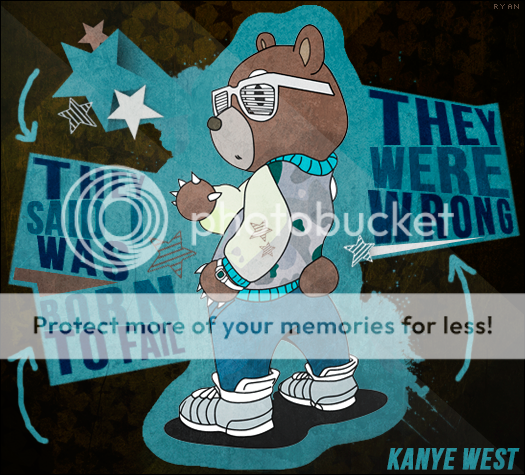
kanyewestdropoutbear-2.png


I made an update to the banner but I didn't delete the old one with the dark background cause that's the one I entered into my battle. I just lightened the background and fixed something with the text that had been driving me crazy.
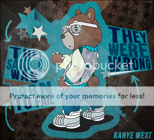
kanyewestdropoutbear-3.png
 
Last edited:

!PHENOM!

Member
Joined
Apr 22, 2012
Messages
301
Reaction score
13
Points
18
Location
India
Typography is awesome...it makrs the graphic more interesting....color choosen also well...a neat and slick work....keep it up
 

The_King

Active Member
Joined
Mar 18, 2012
Messages
1,964
Reaction score
18
Points
38
Age
31
Location
Illinois
The portion with the bear and the typography is awesome. Unique approach that was executed perfectly.
My problem with the piece is that the surrounding background is just weirdly colored. I think if you would've brightened it/used more intense colors, the piece would've been better. Right now, it looks like a really appealing central focus slapped on an ugly brown background.
8/10.
 

Ryan

Member
Joined
Dec 12, 2010
Messages
665
Reaction score
7
Points
18
Location
United States of America
I suppose I see that point. I mean, I did do background work. It wasn't supposed to be bland but at the same time I didn't want to draw focus away from the center piece. Maybe a lighter brown would've worked? I definitely wanted to do a brown background cause I think brown works so well with the light blue.
 
Last edited: