Not really a fan of it to be honest.
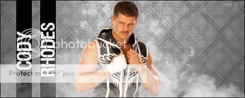
I'm normally not a fan of saying that every sig should "smudge and blend" and crap like that, but it's clear that this design is just four layers stuck together.
I'd recommend maybe darkening the background first, because it's a bit too bright for the smoke effect you have there. After that it'll be easier to create a good depth of field wit the smoke both in front of and behind Cody.
Don't be afraid to mess around with the picture of Rhodes either, because it looks like a picture taken straight from a generic photo shoot. It can be hard to do, but layer styles and adjustments can bring out some good results.


