Cody Rhodes

  • Welcome to "The New" Wrestling Smarks Forum!

    I see that you are not currently registered on our forum. It only takes a second, and you can even login with your Facebook! If you would like to register now, pease click here: Register

    Once registered please introduce yourself in our introduction thread which can be found here: Introduction Board


Doink

Active Member
Joined
Feb 20, 2011
Messages
1,696
Reaction score
23
Points
38
Location
Liverpool
Favorite Wrestler
albertodelrio
Favorite Wrestler
reymysterio
Favorite Wrestler
edge
Favorite Wrestler
chrisjericho
Favorite Wrestler
christian
Favorite Wrestler
romanreigns
Rhodes_zps900f6f8a.jpg


Hate/Rate/Comment
 

John McHenry

John McHenry
Joined
Jun 12, 2011
Messages
21,173
Reaction score
2,529
Points
113
Location
Ohio
Favorite Wrestler
dolphziggler2
Favorite Wrestler
mrperfect2
Favorite Wrestler
chrisjericho
Favorite Wrestler
brianpillman
Favorite Wrestler
shaneomac
Favorite Wrestler
stonecold2
I think I'd have smoke/fog on the sides of Cody leaving him a bit more clear and the sides a bit more filled but I like it.
 
  • Like
Reactions: 1 person

Gimmick

Well-Known Member
Joined
Aug 19, 2012
Messages
1,361
Reaction score
58
Points
48
Location
Ireland
Favorite Wrestler
danielbryan2
Favorite Wrestler
hhh
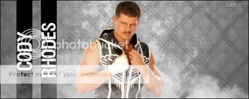
Not really a fan of it to be honest.

I'm normally not a fan of saying that every sig should "smudge and blend" and crap like that, but it's clear that this design is just four layers stuck together.

I'd recommend maybe darkening the background first, because it's a bit too bright for the smoke effect you have there. After that it'll be easier to create a good depth of field wit the smoke both in front of and behind Cody.

Don't be afraid to mess around with the picture of Rhodes either, because it looks like a picture taken straight from a generic photo shoot. It can be hard to do, but layer styles and adjustments can bring out some good results.