- Joined
- Apr 16, 2016
- Messages
- 44,344
- Reaction score
- 19,830
- Points
- 128
- Location
- New Brunswick, Canada
- Favorite Wrestler
-

- Favorite Wrestler
-

- Favorite Wrestler
-

- Favorite Wrestler
-

- Favorite Wrestler
-

- Favorite Wrestler
-

- Favorite Sports Team
-

- Favorite Sports Team
-

- Favorite Sports Team
-

- Favorite Sports Team
-

The name of the thread says it all. There have been plenty of championship belts which have been praised like crazy (and the opposite) such as the classic "Big Gold," the Winged Eagle and Big Eagle WWF titles, to the white strapped IC title and even some like the AEW World Championship have received mostly great praise. But what is one championship belt you think gets overlooked in terms of being a great design?
I'll go with a set of titles that I really think are underrated.
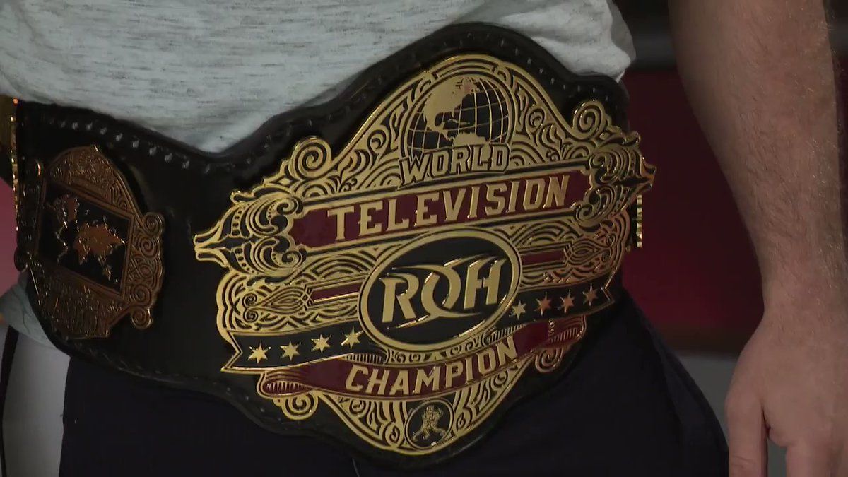
First, the old ROH World Championship before TK switched to the classic design, and the ROH World Women's title which keeps the same main design.
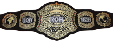
Something about the design just screams "Prestigious" and gives me vibes of the Big Gold belt mixed with the WWE Undisputed Title with a modern twist.
Then I'll do two from oddly enough, IMPACT Wrestling today/recent.
The first is the Impact Tag Team Championships. Now the title has had two designs in this modern look with one being blue and the other red, but the tag team title I'll go with blue.

Then the X Division Championship, except that one I give the nod to its red trim, but both colours work.

 I feel those two titles have futursitic vibes which is odd yet really works. The red trim gives a gritty feel while the blue is more clean, so take it or leave it.
On that note: What title designs you find underrated?
I'll go with a set of titles that I really think are underrated.
First, the old ROH World Championship before TK switched to the classic design, and the ROH World Women's title which keeps the same main design.
Something about the design just screams "Prestigious" and gives me vibes of the Big Gold belt mixed with the WWE Undisputed Title with a modern twist.
Then I'll do two from oddly enough, IMPACT Wrestling today/recent.
The first is the Impact Tag Team Championships. Now the title has had two designs in this modern look with one being blue and the other red, but the tag team title I'll go with blue.
Then the X Division Championship, except that one I give the nod to its red trim, but both colours work.
On that note: What title designs you find underrated?


:format(png)/cdn.vox-cdn.com/imported_assets/1171710/TNA_World_Heavyweight_Championship_Belt.png&sa=U&ved=0ahUKEwiTuquUpe_5AhXmmGoFHa_zDdwQ5hMIBQ&usg=AOvVaw0CtxAIcN9wu2SCa1gCOgXg)