Ryan's graphics

  • Welcome to "The New" Wrestling Smarks Forum!

    I see that you are not currently registered on our forum. It only takes a second, and you can even login with your Facebook! If you would like to register now, pease click here: Register

    Once registered please introduce yourself in our introduction thread which can be found here: Introduction Board


Ryan

Member
Joined
Dec 12, 2010
Messages
665
Reaction score
7
Points
18
Location
United States of America
I haven't made anything in 7-8 months, but I used to make graphics. Seeing all these graphics makers on here is motivating me a bit. I might have to dust off Photoshop.

Anyway, figured I'd show you guys a few examples what I can do once I get back up to speed.

halo-1.png


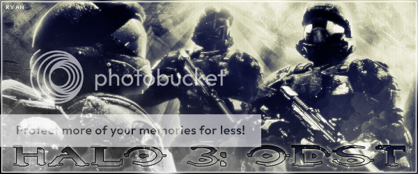
halo3odst.png


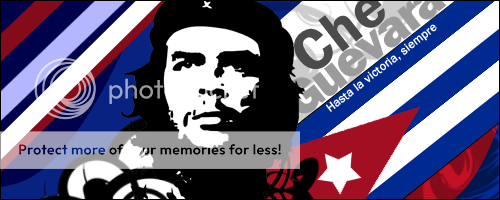
cheguevara.png


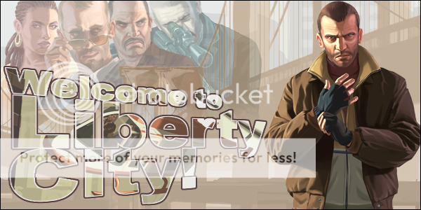
gtaiv.png


edge-tribute.png


Here are a few of the box arts I've made for DVDs/video games on another site:

http://img682.imageshack.us/img682/5708/arkhamasylumcover.png
http://img27.imageshack.us/img27/8489/savingprivateryancoverf.png

I drew 90% of what's on the next one on Illustrator so I'm really proud of it.
http://img259.imageshack.us/img259/8249/dkcrfinal3d.png
http://img834.imageshack.us/img834/6189/lbpfinal.jpg

And a poster I made for my psychology class:

http://img689.imageshack.us/img689/1551/psychologyproject.png

The ones I put the links for are rather large so I didn't want to stretch the topic out.
 
Last edited:

The_King

Active Member
Joined
Mar 18, 2012
Messages
1,964
Reaction score
18
Points
38
Age
31
Location
Illinois
Top 3 are top quality work, especially the Che sig. That one is AWESOME. I've seen all of them in the past though back at SDGL.

The fourth one is a bit plain for my taste. Well executed though.

Edge sig is very unique and pretty good. Not a big fan of the banner going through it but still good. The pic layout is really cool.

Even though we don't get along, really good stuff! I'd like to see more.
 

Ryan

Member
Joined
Dec 12, 2010
Messages
665
Reaction score
7
Points
18
Location
United States of America
Maybe we'll get along slightly better now that we're both just members. Thank you for the compliment, I appreciate it. I believe I did post almost all of those on SDGL except for possibly the Saving Private Ryan cover, definitely the Donkey Kong cover, the Little Big Planet cover and the poster. Like I said, this was just a showcase of the ones I thought were good and the Che sig is definitely one of my favorites. I think it's been my sig for over two years now.
 

The_King

Active Member
Joined
Mar 18, 2012
Messages
1,964
Reaction score
18
Points
38
Age
31
Location
Illinois
Eh, we can give a shot at least!

I didn't notice the covers, so I'll drop some comments on them.
Saving Private Ryan one is simple but effective. I remember that Arkham Asylum one, and the effects on that are right up my alley. Great work!

The Donkey Kong one and Little Big Planet one are really good as well. Very clean and very professional looking. The Little Big Planet could be the box art!

Psychology poster is clean, a bit boring, but I'm sure it's better than what most people probably made! It definitely looks professional.
 

Ryan

Member
Joined
Dec 12, 2010
Messages
665
Reaction score
7
Points
18
Location
United States of America
Eh, we can give a shot at least!

I didn't notice the covers, so I'll drop some comments on them.
Saving Private Ryan one is simple but effective. I remember that Arkham Asylum one, and the effects on that are right up my alley. Great work!

The Donkey Kong one and Little Big Planet one are really good as well. Very clean and very professional looking. The Little Big Planet could be the box art!

Psychology poster is clean, a bit boring, but I'm sure it's better than what most people probably made! It definitely looks professional.

I'm not saying it'll be a buddy-buddy relationship either, but you know. Yea, the psychology one was basically made to be effective for the project. It actually still took a long time just because I had to make it big enough to print out on a poster.