
Mobile version
- Thread starter Roi
- Start date
-
Welcome to "The New" Wrestling Smarks Forum!
I see that you are not currently registered on our forum. It only takes a second, and you can even login with your Facebook! If you would like to register now, pease click here: Register
Once registered please introduce yourself in our introduction thread which can be found here: Introduction Board
You are using an out of date browser. It may not display this or other websites correctly.
You should upgrade or use an alternative browser.
You should upgrade or use an alternative browser.
More options
Who Replied?
Yes, it's frustrating. I have to highlight the text to see what notification it is. It was fixed before but hasn't been updated since Xanth broke it.

Solidus said:I've applied some changes to the style, please let us know what you think.
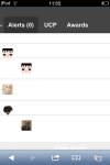
Awesome.maybe if u aliniate to the center... Cuz part of the box cannot be seen .
Attachments
- Joined
- Dec 16, 2011
- Messages
- 63,815
- Reaction score
- 6,080
- Points
- 1
- Location
- United Kingdom of Ambrose
- Website
- wweforums.net
Rodrigo said:Awesome.maybe if u aliniate to the center... Cuz part of the box cannot be seen .
Yea, when I find that setting.
It looks more squashed on your phone than mine though.
Crayo said:So tempted to just buy a brand new nice mobile theme.
We'd still have this problem.
- Joined
- Dec 16, 2011
- Messages
- 63,815
- Reaction score
- 6,080
- Points
- 1
- Location
- United Kingdom of Ambrose
- Website
- wweforums.net
Solidus said:We'd still have this problem.
Regardless, this one is so ugly. It can't just be me that thinks that. I think a new mobile easy-to-use theme which is aesthetically pleasing would be a beneficial acquisition to the forum instead of a waste, but I bet it'd be rather expensive. I might enquire about it to a few MyBB people.

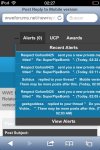
Solidus said:I'm thinking that clicking "alerts" can go straight to the page, instead of opening a dropdown on mobile.
I've done this. Made the page it links to tidier as well.
Someone quote me so I know nothing is broke.
- Joined
- Dec 16, 2011
- Messages
- 63,815
- Reaction score
- 6,080
- Points
- 1
- Location
- United Kingdom of Ambrose
- Website
- wweforums.net
Solidus said:I've done this. Made the page it links to tidier as well.
Someone quote me so I know nothing is broke.
test
Perfect.
I've just made a few visual changes too. The list, for those interested
- Moved navigation to the footer, made the text smaller and removed the grey background.
- Hidden sub-forums on the index.
- Changed thead colour to blue. (the background behind "Backstage" and "Professional Wrestling")
- Made the very top smaller ( alerts, ucp, ect.)
Feedback, mobile users?
More:
Removed avatar from threads (they were tiny anyway)
Removed the grey box near the top which said "Author" and "Post"
Removed the underline on usernames and reputation
Increased the text size of "Warn", "PM", "Quote" ect on threads.
Removed avatar from threads (they were tiny anyway)
Removed the grey box near the top which said "Author" and "Post"
Removed the underline on usernames and reputation
Increased the text size of "Warn", "PM", "Quote" ect on threads.
- Joined
- Dec 16, 2011
- Messages
- 63,815
- Reaction score
- 6,080
- Points
- 1
- Location
- United Kingdom of Ambrose
- Website
- wweforums.net
- Joined
- Sep 17, 2012
- Messages
- 4,734
- Reaction score
- 1,408
- Points
- 0
- Age
- 32