


Looks fantastic. Loving the updated shit. Can't wait to see the stage.

AEW Dynamite March 6th, 2024: All The Fall Out of Revolution
- Thread starter O-Blaze
- Start date
-
Welcome to "The New" Wrestling Smarks Forum!
I see that you are not currently registered on our forum. It only takes a second, and you can even login with your Facebook! If you would like to register now, pease click here: Register
Once registered please introduce yourself in our introduction thread which can be found here: Introduction Board
You are using an out of date browser. It may not display this or other websites correctly.
You should upgrade or use an alternative browser.
You should upgrade or use an alternative browser.
More options
Who Replied?

- Joined
- Jun 28, 2010
- Messages
- 189,540
- Reaction score
- 41,597
- Points
- 148
- Age
- 39
- Location
- Wrestling Forums
- Website
- wrestlingsmarks.com
- Favorite Wrestler
-

- Favorite Wrestler
-

- Favorite Wrestler
-

- Favorite Wrestler
-

- Favorite Wrestler
-

- Favorite Wrestler
-

- Favorite Sports Team
-

- Favorite Sports Team
-

- Favorite Sports Team
-

- Favorite Sports Team
-

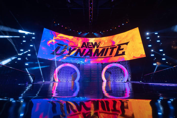
Oh, the main logo is for sure but if you look at some of the stuff in the background, it’s definitely got some splatter.Splitting hairs perhaps but the Dynamite logo is a rainbow gradient, not splattered.
- Joined
- Jun 28, 2010
- Messages
- 189,540
- Reaction score
- 41,597
- Points
- 148
- Age
- 39
- Location
- Wrestling Forums
- Website
- wrestlingsmarks.com
- Favorite Wrestler
-
- Favorite Wrestler
-
- Favorite Wrestler
-
- Favorite Wrestler
-
- Favorite Wrestler
-
- Favorite Wrestler
-
- Favorite Sports Team
-
- Favorite Sports Team
-
- Favorite Sports Team
-
- Favorite Sports Team
-
In fact, there’s like a diamond band that I didn’t completely notice before on the edge and it’s in the you look up at the upper left side, especially it’s got almost every color in the NXT 2.0 logo. But again I don’t mind I actually liked that aesthetic.
- Joined
- Jun 28, 2010
- Messages
- 189,540
- Reaction score
- 41,597
- Points
- 148
- Age
- 39
- Location
- Wrestling Forums
- Website
- wrestlingsmarks.com
- Favorite Wrestler
-
- Favorite Wrestler
-
- Favorite Wrestler
-
- Favorite Wrestler
-
- Favorite Wrestler
-
- Favorite Wrestler
-
- Favorite Sports Team
-
- Favorite Sports Team
-
- Favorite Sports Team
-
- Favorite Sports Team
-
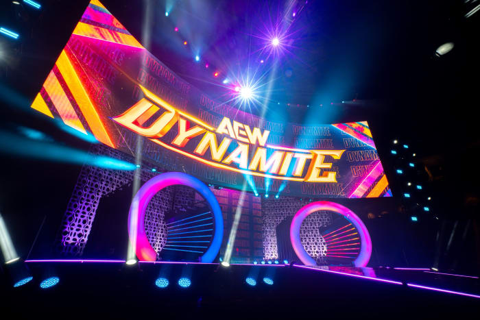
Yeah, this new match graphic is the tits. I love it.also

I'm glad the red and blue laser look was short-lived. I thought that was a really lame, generic backwards move from the OG color splatter look.
- Joined
- Jun 28, 2010
- Messages
- 189,540
- Reaction score
- 41,597
- Points
- 148
- Age
- 39
- Location
- Wrestling Forums
- Website
- wrestlingsmarks.com
- Favorite Wrestler
-
- Favorite Wrestler
-
- Favorite Wrestler
-
- Favorite Wrestler
-
- Favorite Wrestler
-
- Favorite Wrestler
-
- Favorite Sports Team
-
- Favorite Sports Team
-
- Favorite Sports Team
-
- Favorite Sports Team
-
I didn’t mind the laser presentation. The only thing I thought was weird was they was doing both red and blue rather than just picking one of the two specially when you had collision, basically doing a red color scheme.
- Joined
- Dec 12, 2010
- Messages
- 21,371
- Reaction score
- 16,494
- Points
- 118
- Age
- 40
- Location
- Slam Diego
- Favorite Wrestler
-

- Favorite Wrestler
-

- Favorite Wrestler
-

- Favorite Wrestler
-

- Favorite Wrestler
-

- Favorite Wrestler
-
- Favorite Sports Team
-

- Favorite Sports Team
-


- Joined
- Dec 2, 2019
- Messages
- 268,200
- Reaction score
- 85,151
- Points
- 118
- Age
- 39
- Favorite Wrestler
-

- Favorite Wrestler
-

It was sharp but very uninspired color scheme wise. Always preferred the off colors like the orange for rampageI'm glad the red and blue laser look was short-lived. I thought that was a really lame, generic backwards move from the OG color splatter look.
- Joined
- Jun 28, 2010
- Messages
- 189,540
- Reaction score
- 41,597
- Points
- 148
- Age
- 39
- Location
- Wrestling Forums
- Website
- wrestlingsmarks.com
- Favorite Wrestler
-
- Favorite Wrestler
-
- Favorite Wrestler
-
- Favorite Wrestler
-
- Favorite Wrestler
-
- Favorite Wrestler
-
- Favorite Sports Team
-
- Favorite Sports Team
-
- Favorite Sports Team
-
- Favorite Sports Team
-
If you have a unique presentation, you know that’s always been my bread and butter that’s why I really like the fact that TNA when they went back to the red logo they didn’t go back to having red ropes. Instead they decided to use the secondary color and have yellow ropes.
Now, of course, NXT has used yellow ropes but it’s been used far less than red.
Now, of course, NXT has used yellow ropes but it’s been used far less than red.
- Joined
- Dec 23, 2011
- Messages
- 407,164
- Reaction score
- 171,003
- Points
- 128
- Age
- 29
- Location
- Texas
- Favorite Wrestler
-
- Favorite Wrestler
-

- Favorite Wrestler
-

- Favorite Wrestler
-

- Favorite Wrestler
-

- Favorite Wrestler
-

- Favorite Sports Team
-

- Favorite Sports Team
-

- Favorite Sports Team
-

- Favorite Sports Team
-

- Joined
- Dec 2, 2019
- Messages
- 268,200
- Reaction score
- 85,151
- Points
- 118
- Age
- 39
- Favorite Wrestler
-
- Favorite Wrestler
-
- Joined
- Dec 2, 2019
- Messages
- 268,200
- Reaction score
- 85,151
- Points
- 118
- Age
- 39
- Favorite Wrestler
-
- Favorite Wrestler
-

- Joined
- Dec 23, 2011
- Messages
- 407,164
- Reaction score
- 171,003
- Points
- 128
- Age
- 29
- Location
- Texas
- Favorite Wrestler
-
- Favorite Wrestler
-
- Favorite Wrestler
-
- Favorite Wrestler
-
- Favorite Wrestler
-
- Favorite Wrestler
-
- Favorite Sports Team
-
- Favorite Sports Team
-
- Favorite Sports Team
-
- Favorite Sports Team
-

- Joined
- Dec 2, 2019
- Messages
- 268,200
- Reaction score
- 85,151
- Points
- 118
- Age
- 39
- Favorite Wrestler
-
- Favorite Wrestler
-
For those who like branded merch :
All AEW branded (logo) merch is 50% until Sunday on AEWSHOP. This somehow includes the All In jersey at 50% , only avail atm in large. I might order that on friday.
All AEW branded (logo) merch is 50% until Sunday on AEWSHOP. This somehow includes the All In jersey at 50% , only avail atm in large. I might order that on friday.