XBA BTB Help Poll

  • Welcome to "The New" Wrestling Smarks Forum!

    I see that you are not currently registered on our forum. It only takes a second, and you can even login with your Facebook! If you would like to register now, pease click here: Register

    Once registered please introduce yourself in our introduction thread which can be found here: Introduction Board


Which poster is better?

  • [IMG]http://i69.photobucket.com/albums/i57/xtremebadass/3HrRawIII.jpg[/IMG]

    Votes: 0 0.0%
  • [IMG]http://i69.photobucket.com/albums/i57/xtremebadass/3HrRawIII-2.jpg[/IMG]

    Votes: 0 0.0%

  • Total voters
    0

xtremebadass

Guest
Alright, now in my BTB I have 3 Hour Raw's in place of SmackDown's PPV's. I am on my third installment. In the past I have had other members make the poster for me, here are the first two...

3HrRaw.jpg
3HrRawII-1.png


And now I made one a couple weeks back for the third one...
3HrRawIII.jpg


And now I just made one a couple minutes ago and think it maybe better...
3HrRawIII-2.jpg


Which one is better? The blue one or the red one with Goldberg?

Replies will be repped and well appreciated
 

Moonlight Drive

Guest
Well firstly I think that is an idea I may have to steal :shifty:

But honeslty, the second one is more appealing to me. It has more of the feel for a Raw show, plus I just like the style.

So yeah, Number 2
 

seX-Power

Guest
As -HBK- said, the second one looks more like a Raw show, because Raw uses more firy colours and just seems better suited. In the 2nd one the charachter placing is better and I like the background way better, as well as the shading for the RAW logo. Both were unique and great but the 2nd one just seemed better suited for this occasion, due to its more suited colours and better pictures of the wrestlers
 

TK.GFX

Member
Joined
Nov 30, 2007
Messages
520
Reaction score
0
Points
16
Age
30
Location
Asheville, NC
On the first one, The background, and the brushes you have over it aren't too bad, but the PSD is way too low quality. I don't like the outer glow over the Spike and WWE logos, but it looks good around the RAW logo.

On the second one, i like the background, and the two Trips PSDs are blended in quite nicely. I think the outerglow around Goldberg should have just been left out, but yet again, the glow does look good around the RAW logo, and the text.

The second poster is the better one for sure, and it gets my vote.
 

Wrestling Station

Guest
You are having a huge problem with your backgrounds. You need to work on this part first.
 

xtremebadass

Guest
This is probably a broad question, but, where should I start, what's the first step in making a good bg?
 

Wordlife

Guest
well I love the 2nd one man... so I picked the 2nd one, looks awesome
 

THE Renegade Diesel

Active Member
Joined
Jun 26, 2008
Messages
1,879
Reaction score
0
Points
36
Age
29
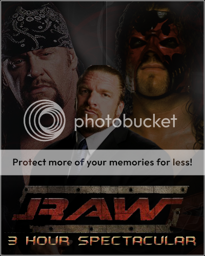
Poster One: Overall this looks actually more like a summerslam poster. The PSD isn't the best, but those brushes, (I think they are brushes) are cool. It just doesn't really suit what you were going for. I mean it looks like Triple H is somewhat of a tornadoe, but it looks wierd. The text isn't the best, but I will touch on that in a minute. The stripes in the back are Summerslam looking as stated already, and I didn't like how you replaced RAW's original red color with blue =/

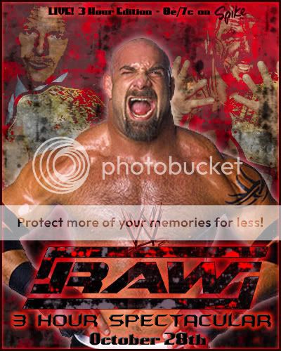
Second Poster: More like a RAW poster, but honestly this is pretty mediocre. The background looks like something I can draw up from MS Paint. The PSD placing is cool, and creative. I wouldv'e liked it so much better if you switched PSD's (moving the one on the left to the right;vise versa), took out the one of him in a suit, and replaced it with one of him with the title on the left. You probably couldn't find it but that wouldv'e just looked cool to me. Text is same as the first, but once again I will touch on that topic in just a second. The blending is ok. This was if anything a hair better than the first, but neither are as good as your work on the Unforgiven poster which you already know how I felt of it.

Overall: Both posters were average. You can do better XBA, seriously man. Anyways, the second one was if anything a hair better. Now the text. I have no clue if I'm the only one who notices, but for about EVERY poster, or match preview you make. You use the same font!!! LOL! For your attempt at CMS's Turning Point PPV-Same font. For Unforgivens poster, AND match previews- Once again. Same font. GET SOME NEXT FONT'S!! I find it funny, but anyways. I give it to the second poster. I mean its not like its better than the first, honestly I just told my sister to pick a number 10, or 20.

Poster Making: What I usually do is just make the whole canvas one solid color(usually the main color of the PPV). Then, I add some big ass brushes which can take up a nice amount of space. I add these little letters or something from some alchemy brush set I downloaded, which just add a cool feel to it. I then add the PSD's, and blend (Almost all the time). I can get more deeper into this but just PM me man.