TNA Rebrand Discussion Thread

  • Welcome to "The New" Wrestling Smarks Forum!

    I see that you are not currently registered on our forum. It only takes a second, and you can even login with your Facebook! If you would like to register now, pease click here: Register

    Once registered please introduce yourself in our introduction thread which can be found here: Introduction Board


Rosie

Dark Side
Joined
Apr 16, 2016
Messages
44,646
Reaction score
20,034
Points
128
Location
New Brunswick, Canada
Favorite Wrestler
9yQJpez
Favorite Wrestler
edge
Favorite Wrestler
dJvrW4y
Favorite Wrestler
kevinsteen
Favorite Wrestler
Se3BZPQ
Favorite Wrestler
q9gbHdQ
Favorite Sports Team
2DciFqq
Favorite Sports Team
OQcgyMS
Favorite Sports Team
coloradoavalanche
Favorite Sports Team
vCLYUUD

Kross Rhodes

Israel Has the Right to Exist
Joined
Jun 28, 2010
Messages
172,655
Reaction score
35,364
Points
148
Age
38
Location
Wrestling Forums
Website
wrestlingsmarks.com
Favorite Wrestler
emma
Favorite Wrestler
YA1yyED
Favorite Wrestler
frmoJZU
Favorite Wrestler
nock3cf
Favorite Wrestler
danielbryan3
Favorite Wrestler
tLCb5kv
Favorite Sports Team
WYT3shw
Favorite Sports Team
fRXTMaD
Favorite Sports Team
LechI0u
Favorite Sports Team
RHZ7KJg
IMG_5882.png


I don’t know how legit this logo is, but I’ve seen it pop up a couple times. If it’s the actual logo, it means we’re going all the way back, boys and girls.
 

Deadd2009

Horror Movie Guru
Joined
Oct 13, 2023
Messages
3,119
Reaction score
1,036
Points
113
Age
38
Location
Maryland
Favorite Wrestler
kane
Favorite Wrestler
undertaker
Favorite Wrestler
sting
Favorite Sports Team
lJlFfto
Favorite Sports Team
n1QhWSb
Favorite Sports Team
zEZtX3o
That logo is clean
 
  • Like
Reactions: Kross Rhodes

Kross Rhodes

Israel Has the Right to Exist
Joined
Jun 28, 2010
Messages
172,655
Reaction score
35,364
Points
148
Age
38
Location
Wrestling Forums
Website
wrestlingsmarks.com
Favorite Wrestler
emma
Favorite Wrestler
YA1yyED
Favorite Wrestler
frmoJZU
Favorite Wrestler
nock3cf
Favorite Wrestler
danielbryan3
Favorite Wrestler
tLCb5kv
Favorite Sports Team
WYT3shw
Favorite Sports Team
fRXTMaD
Favorite Sports Team
LechI0u
Favorite Sports Team
RHZ7KJg
That logo is clean
I agree. If this is someone’s idea of a custom logo, they whipped up themselves in only a week, bravo to those guys.

It’s definitely utilizing the new 2024 main logo on top.
 

Butters

That's Me!
Joined
Feb 13, 2021
Messages
102,831
Reaction score
35,021
Points
133
It's a little too hogan colored for me
 

Hoss

HELL IS NOT A MYTH
Joined
Aug 3, 2011
Messages
82,578
Reaction score
30,081
Points
138
Location
Texas
Favorite Wrestler
sting
Favorite Wrestler
stonecold
Favorite Wrestler
chrisjericho
Favorite Wrestler
danielbryan3
It appears fan made to me, but I can't say for sure of course
 

Kross Rhodes

Israel Has the Right to Exist
Joined
Jun 28, 2010
Messages
172,655
Reaction score
35,364
Points
148
Age
38
Location
Wrestling Forums
Website
wrestlingsmarks.com
Favorite Wrestler
emma
Favorite Wrestler
YA1yyED
Favorite Wrestler
frmoJZU
Favorite Wrestler
nock3cf
Favorite Wrestler
danielbryan3
Favorite Wrestler
tLCb5kv
Favorite Sports Team
WYT3shw
Favorite Sports Team
fRXTMaD
Favorite Sports Team
LechI0u
Favorite Sports Team
RHZ7KJg
It appears fan made to me, but I can't say for sure of course
That’s what I am assuming because I don’t know how anyone would’ve gotten their hands on the new logo, but it doesn’t look too shabby. And that the actual TNA part is the new logo.
 

Kross Rhodes

Israel Has the Right to Exist
Joined
Jun 28, 2010
Messages
172,655
Reaction score
35,364
Points
148
Age
38
Location
Wrestling Forums
Website
wrestlingsmarks.com
Favorite Wrestler
emma
Favorite Wrestler
YA1yyED
Favorite Wrestler
frmoJZU
Favorite Wrestler
nock3cf
Favorite Wrestler
danielbryan3
Favorite Wrestler
tLCb5kv
Favorite Sports Team
WYT3shw
Favorite Sports Team
fRXTMaD
Favorite Sports Team
LechI0u
Favorite Sports Team
RHZ7KJg
I’ll post the breakdown of the differences with the new TNA logo in a little bit because I started noticing that there are bigger differences than just making it flat and changing the colors a little bit.
 
  • Like
Reactions: Marty McFourth

Kross Rhodes

Israel Has the Right to Exist
Joined
Jun 28, 2010
Messages
172,655
Reaction score
35,364
Points
148
Age
38
Location
Wrestling Forums
Website
wrestlingsmarks.com
Favorite Wrestler
emma
Favorite Wrestler
YA1yyED
Favorite Wrestler
frmoJZU
Favorite Wrestler
nock3cf
Favorite Wrestler
danielbryan3
Favorite Wrestler
tLCb5kv
Favorite Sports Team
WYT3shw
Favorite Sports Team
fRXTMaD
Favorite Sports Team
LechI0u
Favorite Sports Team
RHZ7KJg
IMG_5957.jpeg

IMG_5952.jpeg


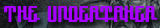
The obvious first change was replacing the muted tan with a vibrant yellow. And the font is smaller.

The second thing is thekinda of copied DeviantArt custom logos that removed the frayed three point ends on the T and A. It’s a straight point now.

Probably the biggest difference is the letters no longer overlap whatsoever. On the original the top of the T overlapped the bottom part of the T and the left of the A was over the bottom line that came out of the N. Instead the letters have spaces where they would’ve touched.

Which interestingly separates the top of the T from the bottom of the T and makes it look like an I, but with a a dash over it instead of a dot. I like it.

The final difference is they removed the tail that came off the N. Instead of have the line run from the T down the N and into the A, it stops with the top of the N. The A is then Pushed further left so it cuts off the bottom of the N instead and then starts its own new line completely the A. Making it easier to read the over TNA initials imo. I like it because it’s a good callback to the 2004 logo and it’s 2024 so it’ll be the 20th anniversary of it, but it’s still its own design.
 
Last edited:

Hoss

HELL IS NOT A MYTH
Joined
Aug 3, 2011
Messages
82,578
Reaction score
30,081
Points
138
Location
Texas
Favorite Wrestler
sting
Favorite Wrestler
stonecold
Favorite Wrestler
chrisjericho
Favorite Wrestler
danielbryan3
Hm. Well when you break it down like that, I actually prefer the original in almost all aspects. The top font being smaller is kind of the only change that I actually like:lol New logo is still totally fine though, I just don't feel like it's been "upgraded" necessarily.
 

Kross Rhodes

Israel Has the Right to Exist
Joined
Jun 28, 2010
Messages
172,655
Reaction score
35,364
Points
148
Age
38
Location
Wrestling Forums
Website
wrestlingsmarks.com
Favorite Wrestler
emma
Favorite Wrestler
YA1yyED
Favorite Wrestler
frmoJZU
Favorite Wrestler
nock3cf
Favorite Wrestler
danielbryan3
Favorite Wrestler
tLCb5kv
Favorite Sports Team
WYT3shw
Favorite Sports Team
fRXTMaD
Favorite Sports Team
LechI0u
Favorite Sports Team
RHZ7KJg
Hm. Well when you break it down like that, I actually prefer the original in almost all aspects. The top font being smaller is kind of the only change that I actually like:lol New logo is still totally fine though, I just don't feel like it's been "upgraded" necessarily.
I usually say updated versus upgraded, but I get what you mean.

Most of these changes were made because it’s a flat logo and wrestling logos tend to be flat now.
 

Hoss

HELL IS NOT A MYTH
Joined
Aug 3, 2011
Messages
82,578
Reaction score
30,081
Points
138
Location
Texas
Favorite Wrestler
sting
Favorite Wrestler
stonecold
Favorite Wrestler
chrisjericho
Favorite Wrestler
danielbryan3
I usually say updated versus upgraded, but I get what you mean.

Most of these changes were made because it’s a flat logo and wrestling logos tend to be flat now.
Makes sense because I'm also not a fan of modern design in general. There's hardly any idiosyncrasy or uniqueness in design these days. Just stripped down, basic as can be a lot of the time sadly.
 

Butters

That's Me!
Joined
Feb 13, 2021
Messages
102,831
Reaction score
35,021
Points
133
Hm. Well when you break it down like that, I actually prefer the original in almost all aspects. The top font being smaller is kind of the only change that I actually like:lol New logo is still totally fine though, I just don't feel like it's been "upgraded" necessarily.
was gonna say the same thing, i like the old logo better tbh. for some reason, I was thinking the entire logo was red originally.