Forum Updates 06/17/2017 - New Theme, Profile Covers

  • Welcome to "The New" Wrestling Smarks Forum!

    I see that you are not currently registered on our forum. It only takes a second, and you can even login with your Facebook! If you would like to register now, pease click here: Register

    Once registered please introduce yourself in our introduction thread which can be found here: Introduction Board


Solidus1

eXit
Joined
Dec 25, 2011
Messages
15,712
Reaction score
4,672
Points
0
As you can clearly see, we have a new theme! A light version is to follow very shortly.
You'll find new member cards, profiles and other nice additions on here.
This should be a great improvement to those of you on mobile devices.
Please let me know if anything looks bad or out of place, there are a couple things I want to tweak, only minor though.

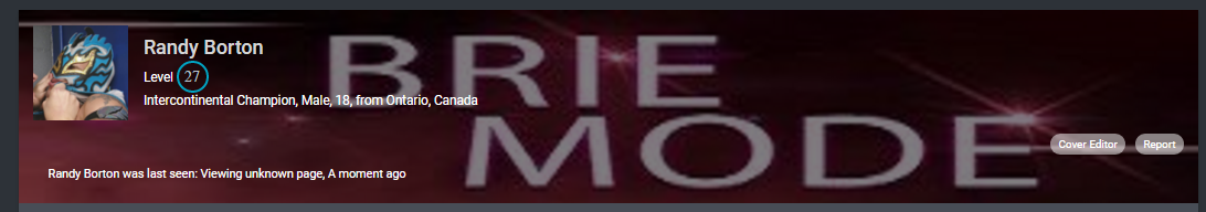
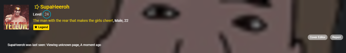
Also, you can now have a profile cover! Just go to your profile and select "Cover Editor".

cover.png

Your cover will be displayed in the sidebar, your member card, the off-canvas navigation for mobile devices and of course, your profile.

Enjoy!
 

Nikki Nitro

The Beast
Champion
Joined
May 21, 2017
Messages
27,455
Reaction score
3,911
Points
0
Location
Beyond the Grave
I've been useing a Mobile phone. This will now make it alot easier for me to navigate the site.
 

CBK_15

The Artiste
Joined
Apr 13, 2016
Messages
547
Reaction score
167
Points
0
Age
26
This is amazing especially as a guy who use his phone on this site a lot.
 

Randy Borton

The Lunatic Fringe
Joined
May 12, 2013
Messages
1,238
Reaction score
661
Points
113
Age
25
Location
Ontario, Canada
b2785bcffc2190bd8fd2893c48a5a75e.png


Currently have the best cover on this site. #BrieMode
 

Smg

The Game
Technician
Joined
Jan 28, 2017
Messages
10,054
Reaction score
167
Points
0
Age
22
Location
Smackdown Live
Amazing! Much cleaner now, loving it. Will take some time to get used to tho but it's worth the effort :)
Thanks once again!
 

Rosie

Dark Side
Joined
Apr 16, 2016
Messages
44,443
Reaction score
19,918
Points
128
Location
New Brunswick, Canada
Favorite Wrestler
9yQJpez
Favorite Wrestler
edge
Favorite Wrestler
dJvrW4y
Favorite Wrestler
kevinsteen
Favorite Wrestler
Se3BZPQ
Favorite Wrestler
q9gbHdQ
Favorite Sports Team
2DciFqq
Favorite Sports Team
OQcgyMS
Favorite Sports Team
coloradoavalanche
Favorite Sports Team
vCLYUUD
Overall, I like it. The font may need to get used to, but overall, I like it. Plus....Cover Pages....Just too bad my image is too big :emoji_slight_frown:
 

The Gipper

The Gipper
Joined
Jan 10, 2014
Messages
17,112
Reaction score
6,398
Points
113
Age
23
i just googled cool cover photos and i got one. XD
 

Mustafar Reginald

The Lunatic Fringe
Joined
Sep 26, 2012
Messages
1,325
Reaction score
628
Points
0
So is there anyway for users who don't like this new mobile presentation of the site to switch back to the old classic version. If there's not (I didn't see one), I'm just one sap who's barely active and simple aesthetics aren't going to deter me from posting so it's not a big deal or anything, but I personally don't like this (I don't like the layout of big blocks, I don't like that the wrestling section gets color than everything is standard, I don't like that BTB breaks the pattern of two at a time [granted just having it as one square than a blank space would've been worse so kudos on the decision to extend it but the old version removes the problem completely], and then I really don't like how the all the things under "Site & Info" follow the BTB measurement despite their [I think if Announcements was going to be highlighted like it has been, then maybe it'd look if Suggestions & Ramps reverted to the big blocks, give some symmetry to the change], I also don't like the big gap into between user posts in threads) and my cellphone can barely run google. So mobile isn't really an option for me.

Profile Covers are definitely neat though, so that's a good consolation for me. I remember years ago that profile covers, or some equivalent, was able to be purchased I think with shop money, or perhaps it was just a feature that eventually got removed. I had Bianca Kajlich as mine, won't be her again but it happened. Right now, it's JoJo's. Though I would like to know what the ideal measurements are.

And just to clarify, I understand I'm the old curmudgeon who doesn't like the new sleek all the kids are into. I just felt that maybe it might be beneficial for others, or perhaps cathartic for myself, in order to air my own personal feelings. Also I want to know the ideal measurements for the profile covers.
 

Solidus1

eXit
Joined
Dec 25, 2011
Messages
15,712
Reaction score
4,672
Points
0
So is there anyway for users who don't like this new mobile presentation of the site to switch back to the old classic version. If there's not (I didn't see one), I'm just one sap who's barely active and simple aesthetics aren't going to deter me from posting so it's not a big deal or anything, but I personally don't like this (I don't like the layout of big blocks, I don't like that the wrestling section gets color than everything is standard, I don't like that BTB breaks the pattern of two at a time [granted just having it as one square than a blank space would've been worse so kudos on the decision to extend it but the old version removes the problem completely], and then I really don't like how the all the things under "Site & Info" follow the BTB measurement despite their [I think if Announcements was going to be highlighted like it has been, then maybe it'd look if Suggestions & Ramps reverted to the big blocks, give some symmetry to the change], I also don't like the big gap into between user posts in threads) and my cellphone can barely run google. So mobile isn't really an option for me.

Profile Covers are definitely neat though, so that's a good consolation for me. I remember years ago that profile covers, or some equivalent, was able to be purchased I think with shop money, or perhaps it was just a feature that eventually got removed. I had Bianca Kajlich as mine, won't be her again but it happened. Right now, it's JoJo's. Though I would like to know what the ideal measurements are.

And just to clarify, I understand I'm the old curmudgeon who doesn't like the new sleek all the kids are into. I just felt that maybe it might be beneficial for others, or perhaps cathartic for myself, in order to air my own personal feelings. Also I want to know the ideal measurements for the profile covers.

No, there is no way to switch back. Unless this gets an overwhelmingly bad reception, this is the default theme for the foreseeable future.
The main focus of the forum is wrestling, which is why those blocks are colored. As for the BTB breaking the pattern, I don't care for it much either, but it's the only way right now unless I make everything below wrestling 1x1.
What gap are you talking about in between posts? What I see is quite small, perhaps 2px bigger than before.
I'm still trying things out on this theme so things may change, maybe everything will be in a 2x2 grid, maybe nothing. We'll see what looks best.