
Poster Challenge
- Thread starter Enigma22
- Start date
-
Welcome to "The New" Wrestling Smarks Forum!
I see that you are not currently registered on our forum. It only takes a second, and you can even login with your Facebook! If you would like to register now, pease click here: Register
Once registered please introduce yourself in our introduction thread which can be found here: Introduction Board
You are using an out of date browser. It may not display this or other websites correctly.
You should upgrade or use an alternative browser.
You should upgrade or use an alternative browser.
More options
Who Replied?
J
Guest

The first step up wasn't that bad...So i dought the second one will bomb...and as for my work it should be done by 2night or 2morrow night...
heres mine
BTW that step up 2 is real good
^^^sorry for the double post....but i put up the wrong version.....can i change it real quick....or is it against the rules of the battle and what not
BTW that step up 2 is real good
^^^sorry for the double post....but i put up the wrong version.....can i change it real quick....or is it against the rules of the battle and what not

- Joined
- May 21, 2007
- Messages
- 710
- Reaction score
- 0
- Points
- 16
- Age
- 36
- Favorite Wrestler
-

- Favorite Wrestler
-

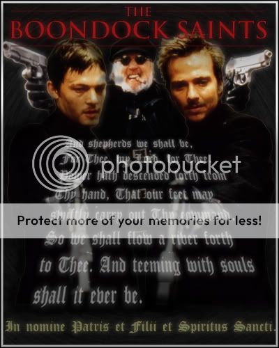
• Enigma - Love the border on yours, Looks very professional and even more so when you think about it from the stnad point of Movie Poster. The text in the center thats skewed like that looks very nice and flows neatly. The PSDs of them are okay but the two up closer to the center have a edge on them that should have been fixed.
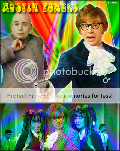
• Spity94 - Im not sure what to really rate here becuase im not really sure how much of this you really did, however the line where the images come together really kills the poster in my opinion.
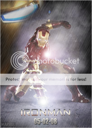
• The Reaper - Very Nice Indeed, The effects with the storm and the ground break aswell as the spiral thing around his arm are very nice effects, and i have to say i love the face in the background, if that wasnt there you would pretty much have a boring empty poster.
• T.K.GFX - ight this one in my opinion is okay, but really brings you down a bit from what i know you can do, the text at the top fits it yes, but the drop shadow has to go and be replaced with maybe a glow. the glow around him on the right up top is two bold, i woulda made the glow around 40 or 50% opacity if it was me, maybe a 30% something hard to see but still slightly noticeable. The bold line where you can see two images put together really kills it for my likeness and tells me it was a rush around that area.
After looking over all these my final vote would have to go to..... The Reaper!
• Spity94 - Im not sure what to really rate here becuase im not really sure how much of this you really did, however the line where the images come together really kills the poster in my opinion.
• The Reaper - Very Nice Indeed, The effects with the storm and the ground break aswell as the spiral thing around his arm are very nice effects, and i have to say i love the face in the background, if that wasnt there you would pretty much have a boring empty poster.
• T.K.GFX - ight this one in my opinion is okay, but really brings you down a bit from what i know you can do, the text at the top fits it yes, but the drop shadow has to go and be replaced with maybe a glow. the glow around him on the right up top is two bold, i woulda made the glow around 40 or 50% opacity if it was me, maybe a 30% something hard to see but still slightly noticeable. The bold line where you can see two images put together really kills it for my likeness and tells me it was a rush around that area.
After looking over all these my final vote would have to go to..... The Reaper!
My vote goes to Spity. His piece has the best flow and the best poster look to it. Colour and blending is good, and the texture fits in nicely too.
Yeah Reaper gets the win on this one. Spitys looks the best, but you didn't really do anything to it.. so yeah.. Reaper.