W-olf Gfx

  • Welcome to "The New" Wrestling Smarks Forum!

    I see that you are not currently registered on our forum. It only takes a second, and you can even login with your Facebook! If you would like to register now, pease click here: Register

    Once registered please introduce yourself in our introduction thread which can be found here: Introduction Board


Lover Boy

Certified
Joined
Jul 28, 2011
Messages
8,871
Reaction score
316
Points
83
Location
United Kingdom
Favorite Wrestler
adamcole
Favorite Wrestler
d6hYDrE
Favorite Wrestler
ZIF7zVA
Favorite Sports Team
2JJnnx8
I like both signatures you have recently posted but I think the colouring is off on both of them. The pattern that I have noticed with your work is your colouring is strong. Instead of making the whole signature a certain colour you should fade the colour to give the signature a hint of the colour. It would look better.
 

W-olf

Well-Known Member
Joined
Jan 12, 2012
Messages
1,547
Reaction score
31
Points
48
Thanks but look at the last one posted as Carrie on either side are both with gradient as she asked and the main cut is the actual render I cut with a soft light effect .
 

Lover Boy

Certified
Joined
Jul 28, 2011
Messages
8,871
Reaction score
316
Points
83
Location
United Kingdom
Favorite Wrestler
adamcole
Favorite Wrestler
d6hYDrE
Favorite Wrestler
ZIF7zVA
Favorite Sports Team
2JJnnx8
Yeah I commented on that on the wrong page :lol
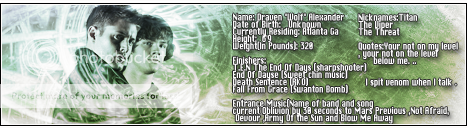
: I was referring to the green one on the other page.
 

W-olf

Well-Known Member
Joined
Jan 12, 2012
Messages
1,547
Reaction score
31
Points
48
Hehe , all good man and thanks for looking and replying I always appreciate feedback .
 

W-olf

Well-Known Member
Joined
Jan 12, 2012
Messages
1,547
Reaction score
31
Points
48
fb7d3f67.png
 

W-olf

Well-Known Member
Joined
Jan 12, 2012
Messages
1,547
Reaction score
31
Points
48
575d0f3f.png


For my PWF character hehe .
 

NovaRoad

Member
Joined
May 25, 2011
Messages
630
Reaction score
18
Points
18
Age
42
Location
New York
Website
stillskystudio.com
My only complaint on that last sig is the text. So hard to read. There are a couple of standard fonts, with the right anti-aliasing, that are readable in smaller sizes (their names escape me at the moment though, sorry lol). Other good fonts for small text would be pixel fonts. At 72 dpi, a good pixel font will look great at 6 - 10 px, with anti-aliasing off.
 

W-olf

Well-Known Member
Joined
Jan 12, 2012
Messages
1,547
Reaction score
31
Points
48
Yea It was a bit crazy on the eyes and I over did with so much text but I at least deleted it from my sig so no one goes blind trying hehe .
 

W-olf

Well-Known Member
Joined
Jan 12, 2012
Messages
1,547
Reaction score
31
Points
48
So I really been diving into gfx lately and since I have posted any of my work here in awhile , why not right?

025715bd.png

4f5f1e75.png