My New Sig I made

  • Welcome to "The New" Wrestling Smarks Forum!

    I see that you are not currently registered on our forum. It only takes a second, and you can even login with your Facebook! If you would like to register now, pease click here: Register

    Once registered please introduce yourself in our introduction thread which can be found here: Introduction Board


Gards Jr.

Active Member
Joined
Oct 21, 2007
Messages
1,468
Reaction score
2
Points
38
Age
30
Location
Australia
ChrisHero2.png


Rate Hate Debate

I personally think it turned out quite well. I want some good comments and tips please. So well Yeah

btw I will be posting all mey new stuff in this thread till the end of the week.
 
Joined
Apr 13, 2008
Messages
250
Reaction score
0
Points
16
Age
29
Location
England
i liek teh texture of teh bg jus not teh colour and u should have rubbed out the line that goes behind him coz u can still see it :laugh:
 

C4

Guest
Now that doesn't look good at all compared to the signature you posted in the Tutorial thread, is it old made in GIMP or what?

It's too plain, bad shadow technique with the yellow and the PSD cutting doesn't hide out too well with the silver edge at the bottom, also the edge doesn't look too smooth. Plus, your text isn't a strong point either and your water mark is almost going out of the signature from the left side. The blending isn't too great as well, your Shawn Michaels signature was 100x times better than this, 5/10.

Just compare the two,

ChrisHero2.png
Michaelscopy-1.png


You do understand what I'm trying to say right?
 
Joined
Apr 13, 2008
Messages
250
Reaction score
0
Points
16
Age
29
Location
England
Now that doesn't look good at all compared to the signature you posted in the Tutorial thread, is it old made in GIMP or what?

It's too plain, bad shadow technique with the yellow and the PSD cutting doesn't hide out too well with the silver edge at the bottom, also the edge doesn't look too smooth. Plus, your text isn't a strong point either and your water mark is almost going out of the signature from the left side. The blending isn't too great as well, your Shawn Michaels signature was 100x times better than this, 5/10.

Just compare the two,

ChrisHero2.png
Michaelscopy-1.png


You do understand what I'm trying to say right?
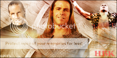
yh i understand the chris hero one suks the hbk ones great :laugh:
 

Gards Jr.

Active Member
Joined
Oct 21, 2007
Messages
1,468
Reaction score
2
Points
38
Age
30
Location
Australia
50248a4be0.png


Okay now I got to admit that this is WAY Better then both those sigs.
 

1chiban

Active Member
Joined
Mar 28, 2008
Messages
1,431
Reaction score
0
Points
36
Age
35
Location
UK
HBK one is still the best by far I'm afraid
 

C4

Guest
Okay now I got to admit that this is WAY Better then both those sigs.

Nope, it's as bad as the Chris Hero one except that there have been some improvements do something like the Michaels one!
 

monkeystyle

Active Member
Joined
Aug 1, 2006
Messages
5,284
Reaction score
3
Points
38
Age
42
Location
Ottawa, ON
I totally dig that Luigi one.

Fuck the naysayers. All they care about is how complicated it is and not whether its art or not.

And of course since C4 is a "legendary" (rofl) gfx'r you should totally listen to everything he says.
 

Gards Jr.

Active Member
Joined
Oct 21, 2007
Messages
1,468
Reaction score
2
Points
38
Age
30
Location
Australia
Okay since I am one day off making a new thread Here is what I just made then

f1c450b9e0.png


For my BTB and the match might or might not happen I am still undecided. But that is what the template for my other matches will be.