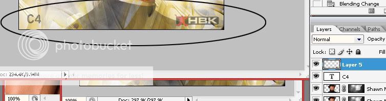
C4
Guest

Alright this is my 4th tutorial over here but not my last :matrix2: , and as I promised it's an Advanced Signature making tutorial which will teach you everything from using a brush and duplicating a layer to complex Layer Masking and eye catching blending modes. :kwasny1:
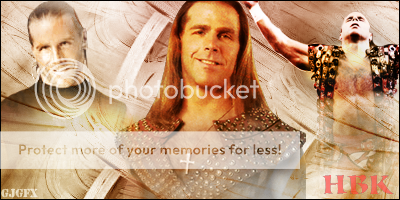
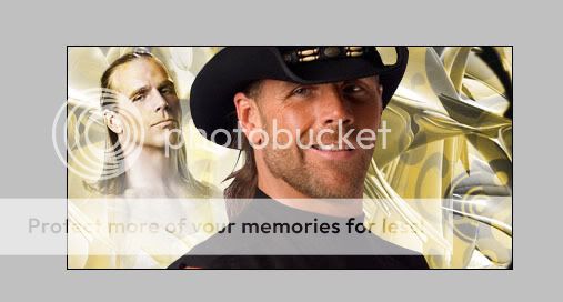
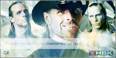
Here is what I'm going to teach you making today:
This is a result of multiple blending mode's and 10's of duplicated layers which used lots of Layer Masking and brushing. Scroll down for the +30 steps, Advanced Signature Tutorial put together by c4.
THE CHECKLIST:
1) Adobe Photoshop CS3, CS2 or any other version
2) Wrestler PSDS - Download from http://www.Italianpsd.net or http://www.psdprotocol.com
3) Good fonts - Download from www.1001freefonts.com
4) Good Brushes - Google "Photoshop *Version* Brushes Download"
5) A good creative mind, and Rep / Thank you for C4 :shifty:
Ok, let's start with our tutorial. Open up Photoshop first; I use Photoshop CS2 and it's the best version in my opinion.
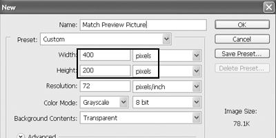
Now go to File > New and select the settings you want, C4's recommended size for a signature is 400*200 pixels.
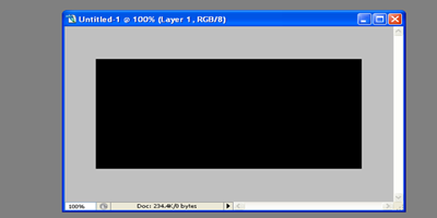
Once you're done, click OK and press "D" on your keyboard to make sure the colors for the background and foreground are black and white, default. Now grab the FILL tool from the toolbox and fill a black color in your background.
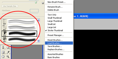
Select the brush tool and from the brushes drop down menu go to: Options > Load > LoadBrushes and select your brushes, the one's which you have downloaded.
Make a new layer by pressing CTRL+SHFT+N on your keyboard and using some decent abstract brushes, spray over the new layer with white color, and you will get something like this:
Looks like a good background but it isn't! aperbag3: So now we are going to apply more to this abstract layer. Firstly, create a new layer over the brushes layer and select the gradient tool.
Drag the gradient over your signature and you will get something like this, the background looks lost and it actually is, but we will get a good effect later on so don't worry about it!
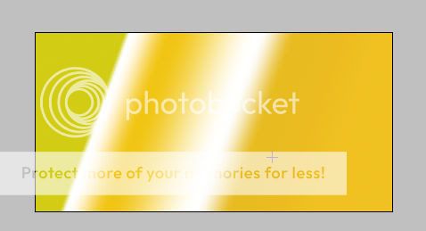
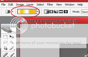
Set the blending mode to soft light on this layer and you will end up with something like this:
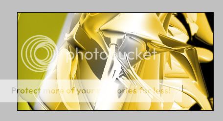
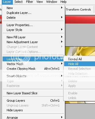
But there is a little problem, look at the left side of the signature it looks unusual so we will get rid of this with a simple layer mask.
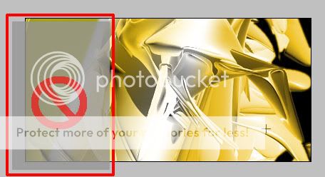
From the drop down menu of layers do what is shown below and select, Layer Mask > Hide all
Now you will see that you're back to your original background, select the same abstract brush that you used earlier and spray it over your masked layer and you will see that the colors are coming back on. Actually what is happening is that you're spraying through the parts of the gradient that you want. Don't spray on the left side as we didn't want that.
You must have these layers present with you:
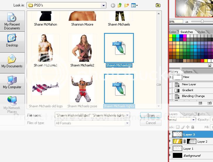
Now we have a pretty decent background and we don't want to spoil the look with an overcrowded background. So you just learned how to create a simple good looking background. Now you have to open up your psds and have them in Photoshop. Open up the ".psd/.png" Wrestler picture file which you downloaded earlier. I have a Folder in 'My Documents' with the name of "PSD" and I save all of the pictures which I download, over there.
Have something like that. Once you select your picture click OK. I selected two Shawn Michaels' picture downloaded from Italianpsd.net we will load another picture of Michaels later on in this tutorial but first we need these two psds.
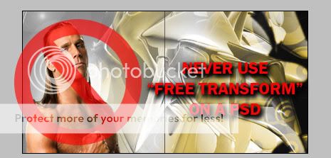
Too bigggg huh?? Don't use 'Free Transform' or any other tool to make it smaller It fucks the resolution.
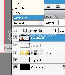
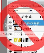
Go to Image>ImageSize and decrease the width, the height will automatically be reduced, move the PSD to the left corner of the signature and set it's blending mode to Luminosity as shown below:
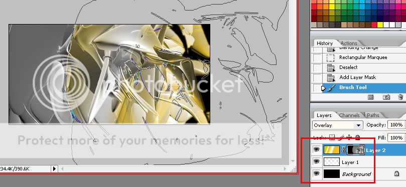
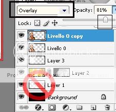
Now press CTRL+J to duplicate the Luminosity layer. Set the blending mode of this duplicated layer to "Overlay" then decrease the opacity to around 80% so that it doesn't hurt your eyes. You should have these layers, the background and brushes can be one layer as well, don't merge these yet.
You must have something like this:
DO NOT MERGE YOUR LAYERS AT THIS POINT
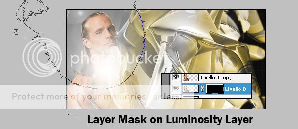
Now with the original, "Luminosity" layer selected go to Layer>Layer Mask and Hide all.
Using some good lens flare brushes, make part of Shawn's face visible and not much of his body kind of like the fade effect.
Do the same thing with the Overlay layer, apply the mask and drag brushes over his face to make it visible if you make a mistake drag a black brush over his face which will make it invisible again, paint white to get it visible.
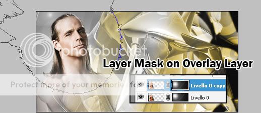
Now in these two little steps you did some basic layer masking which will help you in future graphics. We will do more masking later on but for now, another PSD of Shawn Michaels has to be placed in the center. Once again using the "Image Size" decrease the width and move him to the middle, this picture will be the focus of our signature.
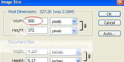
Now grab another Shawn Michaels PSD to fill in the right corner of the signature. Once again using the "Image Size" option decrease it's width and move it to the right corner. Follow these basic steps for blending the PSD:
1) Decrease width using "Image Size"
2) Move the .psd to the right of your signature.
3) Apply a Layer mask and spray paint using a white brush on his face.
4) Set the blending mode of this layer to be "Luminosity"
5) Duplicate the layer, add a lens flare or anything else you want
6) Set the blending mode to Overlay
7) Decrease the opacity to around 80% or something for a cool effect.
8) Have a little experiment by duplicating the layer once again and setting it's blending mode to "Color Dodge" or "Color burn" this depends on the quality, hue, color, saturation, darkness of your psd so this looks good on some psds only, just experiment with this effect if it doesn't look good revert back to what you were doing before.
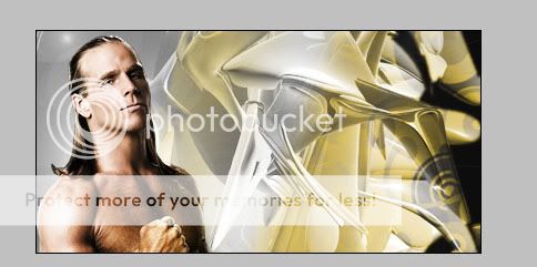
Your signature must look somewhat similar to this:
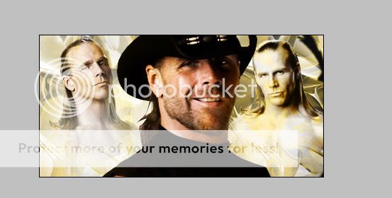
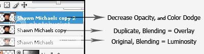
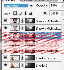
Now duplicate the main focus PSD of Shawn Michaels, follow the same blending steps as before and you will have 3 layers: Original Luminosity, Duplicated Overlay with decreased opacity and Color Dodge (Experiment) with decreased opacity:
Shawn Michaels in the middle must be looking good with such an effect:
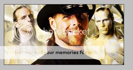
Now we get to complex layer masking of the focus PSD of Shawn. We will add the same layer mask to all 3 layers, make a layer mask on the luminosity layer and another one on the overlay and one last one on the color dodge have them look similar, drag a white brush over the face and everything else you learned earlier in this tutorial. Duplicate the luminosity layer 3 or 4 times to make Shawn Michaels look clear and not distorted :angry2:
Everything looks perfect but we aren't finished yet. To add some more effects on the face of Shawn, add a lens flare to one of the duplicated luminosity layers have it on the third or fourth luminosity duplicated layer, something like this:

Everything looks perfect as we are coming closer to the end of this tutorial. Add some text, your name or anything else you want on it and place it in the appropriate position, go to layer style and use some Bevel and Emboss + Shadows to make the text stand out a little bit, decrease the opacity to have it faded into the background or do anything else with it. Add lightning, brushes almost about everything you can even have a logo come out like mine faded into the background, just experiment with all possibilities! :smile_1:
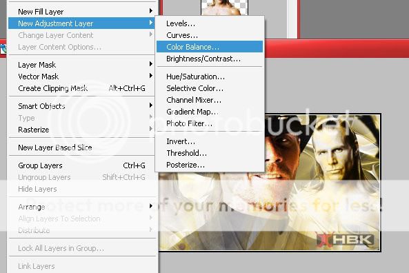
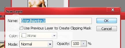
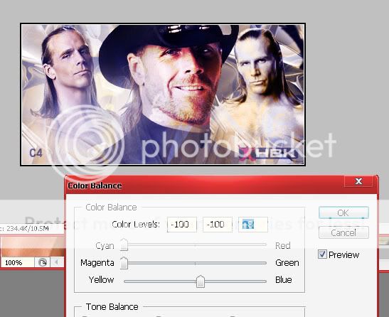
Now for some finishing touches that make the signature look like real artistic work we will add a new adjustment layer on top of everything from Layers> New Adjustment Layer > Color Balance Make sure you have the default settings of Photoshop.
Now adjust the slider left or right to get some good colors, move around and see which color do you prefer experiment with the option, have fun with it and play with it until you're completely satisfied with the result :glare:
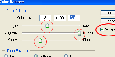
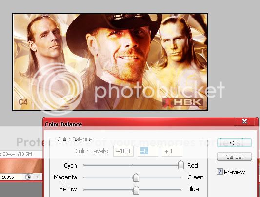
You can have a light shade of blue, green, yellow, golden, brown almost about every other color that you can imagine. One more experiment, go to Layers>New Adjustment Layer > Hue/Saturation this won't work too well with Flashy signatures but it's an experiment. See if you can get something good out of this option if not, leave it.
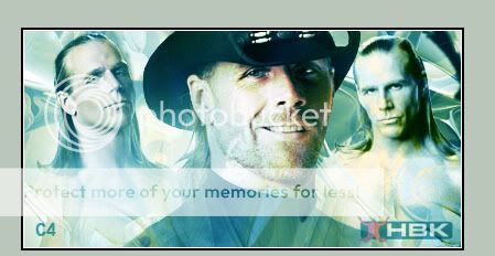
Finally press CTRL+SHFT+E to merge all the layers, now make a new layer and press CTRL+A go to edit and select stroke, use a 3px white stroke. Then once again press CTRL+A and go to edit and this time get a 2px Black stroke, now merge this layer down as well. Then as an experiment go to Filters > Film Grain and add a little grain.
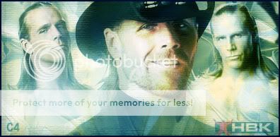
In the end you should have a good looking signature which shows that you put a lot of effort making it, it must be something like this:
This must have helped you out in some or the other way, if it did then please vote if this tutorial was helpful or not, also post your result by trying this tutorial. Every guy who posts his result will be awarded with green rep and speaking of rep, you can rep me if you liked this tutorial. If you have any questions or queries feel free to ask over here! And enjoy making great graphics 24/7! :glare:
- C4 Tutorials!
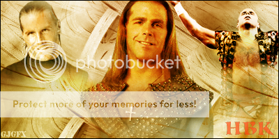
Here is what I'm going to teach you making today:
This is a result of multiple blending mode's and 10's of duplicated layers which used lots of Layer Masking and brushing. Scroll down for the +30 steps, Advanced Signature Tutorial put together by c4.
THE CHECKLIST:
1) Adobe Photoshop CS3, CS2 or any other version
2) Wrestler PSDS - Download from http://www.Italianpsd.net or http://www.psdprotocol.com
3) Good fonts - Download from www.1001freefonts.com
4) Good Brushes - Google "Photoshop *Version* Brushes Download"
5) A good creative mind, and Rep / Thank you for C4 :shifty:
Ok, let's start with our tutorial. Open up Photoshop first; I use Photoshop CS2 and it's the best version in my opinion.
Now go to File > New and select the settings you want, C4's recommended size for a signature is 400*200 pixels.
Once you're done, click OK and press "D" on your keyboard to make sure the colors for the background and foreground are black and white, default. Now grab the FILL tool from the toolbox and fill a black color in your background.
Select the brush tool and from the brushes drop down menu go to: Options > Load > LoadBrushes and select your brushes, the one's which you have downloaded.
Make a new layer by pressing CTRL+SHFT+N on your keyboard and using some decent abstract brushes, spray over the new layer with white color, and you will get something like this:
Looks like a good background but it isn't!
aperbag3: So now we are going to apply more to this abstract layer. Firstly, create a new layer over the brushes layer and select the gradient tool.
Drag the gradient over your signature and you will get something like this, the background looks lost and it actually is, but we will get a good effect later on so don't worry about it!
Set the blending mode to soft light on this layer and you will end up with something like this:
But there is a little problem, look at the left side of the signature it looks unusual so we will get rid of this with a simple layer mask.
From the drop down menu of layers do what is shown below and select, Layer Mask > Hide all
Now you will see that you're back to your original background, select the same abstract brush that you used earlier and spray it over your masked layer and you will see that the colors are coming back on. Actually what is happening is that you're spraying through the parts of the gradient that you want. Don't spray on the left side as we didn't want that.
You must have these layers present with you:
Now we have a pretty decent background and we don't want to spoil the look with an overcrowded background. So you just learned how to create a simple good looking background. Now you have to open up your psds and have them in Photoshop. Open up the ".psd/.png" Wrestler picture file which you downloaded earlier. I have a Folder in 'My Documents' with the name of "PSD" and I save all of the pictures which I download, over there.
Have something like that. Once you select your picture click OK. I selected two Shawn Michaels' picture downloaded from Italianpsd.net we will load another picture of Michaels later on in this tutorial but first we need these two psds.
Too bigggg huh?? Don't use 'Free Transform' or any other tool to make it smaller It fucks the resolution.
Go to Image>ImageSize and decrease the width, the height will automatically be reduced, move the PSD to the left corner of the signature and set it's blending mode to Luminosity as shown below:
Now press CTRL+J to duplicate the Luminosity layer. Set the blending mode of this duplicated layer to "Overlay" then decrease the opacity to around 80% so that it doesn't hurt your eyes. You should have these layers, the background and brushes can be one layer as well, don't merge these yet.
You must have something like this:
DO NOT MERGE YOUR LAYERS AT THIS POINT
Now with the original, "Luminosity" layer selected go to Layer>Layer Mask and Hide all.
Using some good lens flare brushes, make part of Shawn's face visible and not much of his body kind of like the fade effect.
Do the same thing with the Overlay layer, apply the mask and drag brushes over his face to make it visible if you make a mistake drag a black brush over his face which will make it invisible again, paint white to get it visible.
Now in these two little steps you did some basic layer masking which will help you in future graphics. We will do more masking later on but for now, another PSD of Shawn Michaels has to be placed in the center. Once again using the "Image Size" decrease the width and move him to the middle, this picture will be the focus of our signature.
Now grab another Shawn Michaels PSD to fill in the right corner of the signature. Once again using the "Image Size" option decrease it's width and move it to the right corner. Follow these basic steps for blending the PSD:
1) Decrease width using "Image Size"
2) Move the .psd to the right of your signature.
3) Apply a Layer mask and spray paint using a white brush on his face.
4) Set the blending mode of this layer to be "Luminosity"
5) Duplicate the layer, add a lens flare or anything else you want
6) Set the blending mode to Overlay
7) Decrease the opacity to around 80% or something for a cool effect.
8) Have a little experiment by duplicating the layer once again and setting it's blending mode to "Color Dodge" or "Color burn" this depends on the quality, hue, color, saturation, darkness of your psd so this looks good on some psds only, just experiment with this effect if it doesn't look good revert back to what you were doing before.
Your signature must look somewhat similar to this:
Now duplicate the main focus PSD of Shawn Michaels, follow the same blending steps as before and you will have 3 layers: Original Luminosity, Duplicated Overlay with decreased opacity and Color Dodge (Experiment) with decreased opacity:
Shawn Michaels in the middle must be looking good with such an effect:
Now we get to complex layer masking of the focus PSD of Shawn. We will add the same layer mask to all 3 layers, make a layer mask on the luminosity layer and another one on the overlay and one last one on the color dodge have them look similar, drag a white brush over the face and everything else you learned earlier in this tutorial. Duplicate the luminosity layer 3 or 4 times to make Shawn Michaels look clear and not distorted :angry2:
Everything looks perfect but we aren't finished yet. To add some more effects on the face of Shawn, add a lens flare to one of the duplicated luminosity layers have it on the third or fourth luminosity duplicated layer, something like this:
Everything looks perfect as we are coming closer to the end of this tutorial. Add some text, your name or anything else you want on it and place it in the appropriate position, go to layer style and use some Bevel and Emboss + Shadows to make the text stand out a little bit, decrease the opacity to have it faded into the background or do anything else with it. Add lightning, brushes almost about everything you can even have a logo come out like mine faded into the background, just experiment with all possibilities! :smile_1:
Now for some finishing touches that make the signature look like real artistic work we will add a new adjustment layer on top of everything from Layers> New Adjustment Layer > Color Balance Make sure you have the default settings of Photoshop.
Now adjust the slider left or right to get some good colors, move around and see which color do you prefer experiment with the option, have fun with it and play with it until you're completely satisfied with the result :glare:
You can have a light shade of blue, green, yellow, golden, brown almost about every other color that you can imagine. One more experiment, go to Layers>New Adjustment Layer > Hue/Saturation this won't work too well with Flashy signatures but it's an experiment. See if you can get something good out of this option if not, leave it.
Finally press CTRL+SHFT+E to merge all the layers, now make a new layer and press CTRL+A go to edit and select stroke, use a 3px white stroke. Then once again press CTRL+A and go to edit and this time get a 2px Black stroke, now merge this layer down as well. Then as an experiment go to Filters > Film Grain and add a little grain.
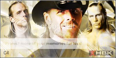
In the end you should have a good looking signature which shows that you put a lot of effort making it, it must be something like this:
This must have helped you out in some or the other way, if it did then please vote if this tutorial was helpful or not, also post your result by trying this tutorial. Every guy who posts his result will be awarded with green rep and speaking of rep, you can rep me if you liked this tutorial. If you have any questions or queries feel free to ask over here! And enjoy making great graphics 24/7! :glare:
- C4 Tutorials!